Here's some old pixel art I made in 1995. Only thing I've added to it is a scanline filter (after x2 scale) original image was 320 x 256 , drawn 1 pixel at a time. I'm such a sucker for hand drawn anti-aliasing!
Monday, 4 November 2013
Tuesday, 15 October 2013
Thursday, 14 March 2013
Ye olde strong man illustration
Another one of my Indie Royale illustrations has recently hit the IR website and this time it's for the upcoming "Mighty Bundle" which of course I cannot say anything about until it goes live when all will be revealed!
It's funny when you create artwork as you can sometimes go through a couple of rough sketches, maybe try a few ideas out, but this one had none of that. I mean what's to do when 'old fashioned strong man lifting weights' is requested? All I needed was a nice cuppa tea and off I went a doodling...
As with most of my recent work it was sketched, inked and painted in MyPaint and then cropped for export using GIMP.
I do so enjoy using quality Open Source software.
Friday, 1 March 2013
Zombie Boy Doodle
Funny what a doodle in MyPaint can turn in to isn't it? Take this one I did yesterday. I've called him "Ronnie Stump Sticks", a zombie boy with out any hands, poor thing.
Not having any hands doesn't stop him from getting on with the afterlife. Oh no, he's quite a resourceful boy and uses all sorts of things in their place, you know the typical every day items like, spoons, forks, drum sticks, celery(Apium graveolens dulce), ok maybe not celery but you get the idea. Using such a wide variety of things does take its toll on his poor arms and as you can imagine it can get a bit messy as
the blood just goes everywhere. Though I have to say it isn't too noticeable when eating his favourite food, cream of tomato soup!
And on that rather small blog post of total nonsense I'm off to make a nice cup of tea.
 |
And on that rather small blog post of total nonsense I'm off to make a nice cup of tea.
Monday, 25 February 2013
Another Indie Royale illustration...
When asked to draw something pertaining to the subject of "Debut" for the upcoming Indie Royale bundle, you could say my creative brain had popped out for a scone and afternoon tea. Nope, no ideas forthcoming until Graeme (IndieRoyale bundle master) suggested a stage with curtains, and thus the image of an old theatre and it's rather rouge stage dressing made it's presence known in my mind! That's it I thought and promptly scribbled down some ideas using my favourite digital painting application, MyPaint.(I sound like an anorak!)
Here's the final result currently live on the Indie Royale site, though once this bundle goes live this link will of course be outdated!
If we look at my original rough below it doesn't look quite like the finished one seen above..Here's why...
I wanted the art to stand out more from the screen than this initial sketch and one quick trick is to use our old friend perspective. For the finished art I would need to draw some perspective lines for the wooden planks on the stage, so why not carry those lines out a little further and use them as a guide for not only the stage, but also the curtain tops too! Seen below you can just make out my blue guide lines which form the basis on which the planks were drawn.
By curving the front of the stage downward not only do we force the perspective out, we also draw the eye towards the centre as the whole stage takes on a bowed appearance. This is re-enforced once I added in the microphone stand. Although the vanishing point is masked behind the red curtain it is important enough to create just enough perspective in order to draw the eye in and complete the illusion of depth. Compare the original rough to the finished illustration and you can see this in full effect.
*Created on my ageing laptop using MyPaint 1.1, Gimp 2.8 and a Wacom tablet running under Linux Mint 14 KDE, which I have to say runs rings round my windows Vista desktop PC that I normally use.
Thursday, 14 February 2013
ET is here and taking our cows!
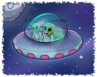
 One of my recent projects was to design the artwork for a pinball game. The first table had the theme of Aliens and UFO's. So not wasting any time I came up with these little chaps who fly about the Nevada desert looking for things to abduct with their dazzling tractor beam of light. OK it's actually a blurred out line with an alpha blended gradient and all that other artistic malarkey, but you get the idea.
Initially I did a concept sketch , why break from the norm eh? After a quick scan into the computer I loaded the newly digitised drawing in to Inkscape where I recreated it using vector lines before colouring in using quite a few layers of fills and gradients, oh and the most important ingredient Tea!. The beauty of vector art is it can be exported to pretty much any resolution. This is brilliant for those times in your life when when 6 months down the line you're asked to do a HD+++ version for iPad Mega Retina 9 or the need arises to create a version in print.

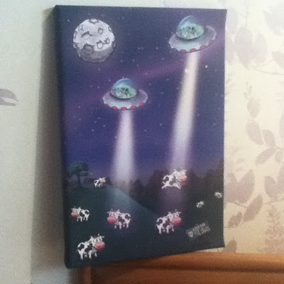
As a test I took the art I'd created for the table and produced a canvas print for my studio wall, the results were excellent.
To finish off here's what the flying saucer looked like prior to me adding colour and shading.
Tuesday, 12 February 2013
Indie Royale Icons
 |
| Lettuce have a bit |
My first piece of art was this rather hungry giant tortoise for their Evolved bundle.
The art style on the website had to be adhered to so my first job was to familiarise myself with the existing look and feel and create the new art in this style.
 |
| Penciltastic! |
 |
For this job I used the most excellent MyPaint in conjunction with Gimp for the odd bit of cutting out and colourising.
Subscribe to:
Comments (Atom)


