

Tuesday, 15 October 2013
Thursday, 14 March 2013
Ye olde strong man illustration
Another one of my Indie Royale illustrations has recently hit the IR website and this time it's for the upcoming "Mighty Bundle" which of course I cannot say anything about until it goes live when all will be revealed!

It's funny when you create artwork as you can sometimes go through a couple of rough sketches, maybe try a few ideas out, but this one had none of that. I mean what's to do when 'old fashioned strong man lifting weights' is requested? All I needed was a nice cuppa tea and off I went a doodling...
As with most of my recent work it was sketched, inked and painted in MyPaint and then cropped for export using GIMP.
I do so enjoy using quality Open Source software.

Friday, 1 March 2013
Zombie Boy Doodle
Funny what a doodle in MyPaint can turn in to isn't it? Take this one I did yesterday. I've called him "Ronnie Stump Sticks", a zombie boy with out any hands, poor thing.
Not having any hands doesn't stop him from getting on with the afterlife. Oh no, he's quite a resourceful boy and uses all sorts of things in their place, you know the typical every day items like, spoons, forks, drum sticks, celery(Apium graveolens dulce), ok maybe not celery but you get the idea. Using such a wide variety of things does take its toll on his poor arms and as you can imagine it can get a bit messy as
the blood just goes everywhere. Though I have to say it isn't too noticeable when eating his favourite food, cream of tomato soup!
And on that rather small blog post of total nonsense I'm off to make a nice cup of tea.
 |
And on that rather small blog post of total nonsense I'm off to make a nice cup of tea.
Monday, 25 February 2013
Another Indie Royale illustration...
When asked to draw something pertaining to the subject of "Debut" for the upcoming Indie Royale bundle, you could say my creative brain had popped out for a scone and afternoon tea. Nope, no ideas forthcoming until Graeme (IndieRoyale bundle master) suggested a stage with curtains, and thus the image of an old theatre and it's rather rouge stage dressing made it's presence known in my mind! That's it I thought and promptly scribbled down some ideas using my favourite digital painting application, MyPaint.(I sound like an anorak!)
Here's the final result currently live on the Indie Royale site, though once this bundle goes live this link will of course be outdated!

If we look at my original rough below it doesn't look quite like the finished one seen above..Here's why...

I wanted the art to stand out more from the screen than this initial sketch and one quick trick is to use our old friend perspective. For the finished art I would need to draw some perspective lines for the wooden planks on the stage, so why not carry those lines out a little further and use them as a guide for not only the stage, but also the curtain tops too! Seen below you can just make out my blue guide lines which form the basis on which the planks were drawn.

By curving the front of the stage downward not only do we force the perspective out, we also draw the eye towards the centre as the whole stage takes on a bowed appearance. This is re-enforced once I added in the microphone stand. Although the vanishing point is masked behind the red curtain it is important enough to create just enough perspective in order to draw the eye in and complete the illusion of depth. Compare the original rough to the finished illustration and you can see this in full effect.

*Created on my ageing laptop using MyPaint 1.1, Gimp 2.8 and a Wacom tablet running under Linux Mint 14 KDE, which I have to say runs rings round my windows Vista desktop PC that I normally use.
Here's the final result currently live on the Indie Royale site, though once this bundle goes live this link will of course be outdated!

If we look at my original rough below it doesn't look quite like the finished one seen above..Here's why...
I wanted the art to stand out more from the screen than this initial sketch and one quick trick is to use our old friend perspective. For the finished art I would need to draw some perspective lines for the wooden planks on the stage, so why not carry those lines out a little further and use them as a guide for not only the stage, but also the curtain tops too! Seen below you can just make out my blue guide lines which form the basis on which the planks were drawn.
By curving the front of the stage downward not only do we force the perspective out, we also draw the eye towards the centre as the whole stage takes on a bowed appearance. This is re-enforced once I added in the microphone stand. Although the vanishing point is masked behind the red curtain it is important enough to create just enough perspective in order to draw the eye in and complete the illusion of depth. Compare the original rough to the finished illustration and you can see this in full effect.
*Created on my ageing laptop using MyPaint 1.1, Gimp 2.8 and a Wacom tablet running under Linux Mint 14 KDE, which I have to say runs rings round my windows Vista desktop PC that I normally use.
Thursday, 14 February 2013
ET is here and taking our cows!
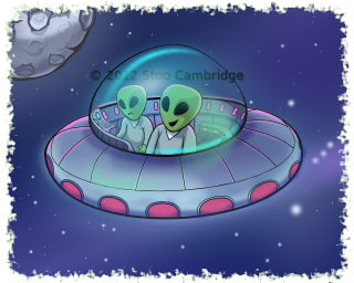 One of my recent projects was to design the artwork for a pinball game. The first table had the theme of Aliens and UFO's. So not wasting any time I came up with these little chaps who fly about the Nevada desert looking for things to abduct with their dazzling tractor beam of light. OK it's actually a blurred out line with an alpha blended gradient and all that other artistic malarkey, but you get the idea.
Initially I did a concept sketch , why break from the norm eh? After a quick scan into the computer I loaded the newly digitised drawing in to Inkscape where I recreated it using vector lines before colouring in using quite a few layers of fills and gradients, oh and the most important ingredient Tea!. The beauty of vector art is it can be exported to pretty much any resolution. This is brilliant for those times in your life when when 6 months down the line you're asked to do a HD+++ version for iPad Mega Retina 9 or the need arises to create a version in print.

As a test I took the art I'd created for the table and produced a canvas print for my studio wall, the results were excellent.

Tuesday, 12 February 2013
Indie Royale Icons
 |
| Lettuce have a bit |
My first piece of art was this rather hungry giant tortoise for their Evolved bundle.
The art style on the website had to be adhered to so my first job was to familiarise myself with the existing look and feel and create the new art in this style.
 |
| Penciltastic! |
 |
For this job I used the most excellent MyPaint in conjunction with Gimp for the odd bit of cutting out and colourising.
Wednesday, 18 July 2012
Nintendo Gamer; Memories of Sensi Soccer on the SNES
Funny how things turn out isn't it?
 |
| July 2012 edition, Sensi SNES Article |
Unfortunately the same can not be said when converting to a totally different microprocessor, say one that has its foot still in the 8bit era. You see the processor in the SNES was at it's brass roots level a MOS 6502, yes 'that' very same family of processors used in the Commodore C64 and many other 8bit computers, consoles and arcade machines. Not that I have anything against the 6502 in fact I cut my coding teeth on it back in the day. Thankfully Nintendo opted to use the updated version developed by Western Design Center which has a wonderful assortment of extras over it's older brother. What extras are these then? Well, extras like 16 bit registers, more instructions and and the ability to address up to 16 megabytes of memory which is somewhat greater than the 6502 and it's comparatively puny 64k addressing range. Cool! (Thanks Wikipedia! come on you didn't think I'd remember all that geek stuff? )
 So what's all that got to do with the price of fish? Well nothing but it does remind us that converting a game isn't a just a case of converting the graphics, changing a few lines of code and hey presto you have a new target platform with which to publish your game on. No, it's far more involved than that, even today with multi platform game engines like Unity or Corona which makes the whole process far easier there are still rules to follow but these falter in my opinion when compared to the technical work required doing it old skool!.
 So anyway as I was saying it's funny how things turn out isn't it? I was going through some old graphics files recently when out of the blue I was contacted by Nintendo Gamer Magazine who invited me to comment on my memories of converting Sensible Soccer to the Super Nintendo. Well it took me a while to remember what we did but after after viewing a few old Amiga IFF files, drinking a large mug of tea (or three) those old memories soon resurfaced and before I knew it I'd written enough waffle to pad out a few paragraphs.
So if you want to know how this version of Sensi Soccer differs from that of the original , grab yourself a copy today! Nintendo Gamer July 2012.
Saturday, 19 May 2012
Inkscape Colour Picker = Cool!
 Quick post today as I've been really, really busy of late.
So a few minutes ago I needed to pick a colour from an image I'd found on that internet thing we all seem to spend our lives using. So I hit F7 moved the mouse curser over to the colour area I wanted and well the resulting hue was not quite what I wanted. .Hmmm if only I could sample a range of colours from an area and acquire the average hue, now that would be cool.
Oh how surprised I was when by total accident I held the mouse button down again but this time I dragged it without letting go. Wow! A circle appears and the further out you drag the larger the circle becomes! No way I thought, but way it was and behold the average colour contained within the circle was picked up and as soon as I let go of the mouse button appeared as the current draw colour. Most excellent!!
So today after using Inkscape daily for the past 8 months or so I have discovered something new and something very useful. Awesome stuff!
Monday, 5 March 2012
Sega World Championship Soccer II (Secret revealed)
 There's a secret that I'm surprised hasn't surfaced by now? It's not something to change societal structure, nor create widespread panic on a global scale. No, this secret is about a game I worked on during my Sensible Software days, a title that was written using elements of the Sensible Soccer code.
The game was Sega World Championship Socer II on the Sega Megadrive/Genesis.
Holy smoke, no way? Get outta here pronto and take your burger with you.(ok ok leave the fries, oh and those onion rings too.. ta)


Unfortunately I don't have any of the original graphics files for this title although there is a slim chance a copy resides on one of my old Amiga drives somewhere. Not to fear though as I have found a copy of the game on a ROM site and using that wonder of modern software technology known as 'emulation' have taken a few screen shots for your delight and my own historical record.
I didn't do all the art, no no no, my partner in crime was ex-Graftgold artist John Lilley who created the title animation and the cut scene animations used throughout the game, with me providing all game sprites, backgrounds and menu art.
Back then it was quite nice to work on something different, yeah yeah I know how different is one footy game to another? Well different with respect to the artwork and view. Let's be honest the appeal of the original Sensi Soccer was the simplistic uncluttered 'see all view' of the game which lead us to adopt an almost icon like style for the sprites and pitch art. So the chance to work on a "secret" project that allowed me to draw big players and create some nice menu icons with lots of flags and formation icons was too cool for school.
 Looking back now through those warm retro loving eyes there is an obvious criticism I could make,"Why are all the players the same?". If I recall memory was quite tight on the cartridge and to keep things within the code structure of the original game everything had to sit within the same framework, including the number of animations for the players and the way they were stored in memory. I believe this was to retain the same colour changing technique used on Sensible Soccer although I could be mistaken. I think you will agree the end result did the job, although the animations are quite crude for their size they work without being too clunky.
 I've recently learned that the blue box European release is actually quite a rare and sought after beast and has been known to fetch at auction as much as £750! Wow, unbelievable!

Having recently played the game via emulation* it's certainly worth trying it out but I would suggest bagging a joypad from somewhere as playing on a keyboard is not going to provide the same experience as using a proper pad. I've got a USB to Sega Saturn pad converter which for this game works brilliantly, especially with a Japanese Saturn pad as they feel great and are easily mapped to cover all Genesis pad functions.
*I tend to use Fusion but Gens will do the job just as well.
That's about it for now, I'll be continuing to document our development of Blobbit Push as we progress but for now it's over and out... until next time that is...(Atari Jaguar... shhhhh)
** To keep up to date with more meandering and waffle from me you can enter you email address (on the right near the top) and each new blog post I write will magically appear in your inbox! WOW! Yes and all spam free too so none of those African Prince fellas offering you a zillion squid for a small administration fee malarkey. **
Thursday, 1 March 2012
What?? HD art for iPad(1.2.3)?? Part 2

Here's a snippet of the new 'updated' Blobbit Push tile set for the Sand Sludge Bog area. Yes I know it looks like the old one, or does it?
Hang on why don't you compare yourself. Marvelous.
(fiddles with some files... uploads...that was so quick , I've not finished typing this yet).
Right then, here's a shot of the old one below.

As you can see in order to make it work on super mega high res screens as featured on the new iPad 3 I have had to vector up the original art so it renders nicely at these new HD screen sizes. Unfortunately there's no magic button so every piece of art has to be recreated again which isn't too bad as I can now go in and add lots of detail and extras I couldn't do before. That's good right?
You can read more about this process in an earlier post I did back in *coughs* erm.. 2010..
I suppose we could have gone down the "pixel" route but in all honest I'm pretty sick of all these pixel games using graphics that back in the day would probably have been slated for being too simple. Funny how peoples perception of pixel art and proper HQ pixel art appear to be so widely separated.
Did I mention Blobbit is now on Facebook? Blobbit the Facebook group
Toodle pip me dears... (until next time)
Subscribe to:
Posts (Atom)